Every website starts clean. The first few pages look great. The CSS is organized. The components are tidy. Then six months pass, twelve new pages get added, three different developers touch the codebase, and suddenly you have 47 different button styles and nobody knows which one is "correct."
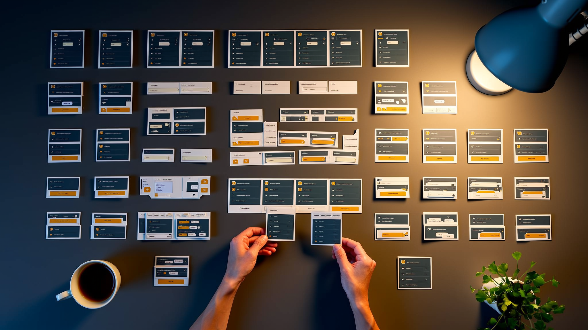
Component-based design solves this problem by treating your UI as a system of reusable building blocks instead of a collection of one-off pages. It is the difference between building with Lego bricks and building with clay. One approach scales. The other turns into a mess.
What Component-Based Design Actually Means
The core idea is simple: break your interface into small, self-contained pieces that each do one thing well. A button is a component. A card is a component. A navigation bar is a component. Each piece encapsulates its own structure, styles, and behavior.
This is not a new concept. React popularized component-based architecture in frontend development, but the idea goes back to object-oriented programming principles... encapsulation, single responsibility, composition over inheritance.
The practical benefit is that you build a component once and use it everywhere. Need a button on your homepage, your pricing page, and your checkout flow? Same component, different props. Change the button design in one place, and it updates across every page that uses it. No hunting through CSS files. No missed instances. No inconsistency.
Atomic Design: A Framework for Thinking in Components
Brad Frost's Atomic Design methodology gives you a mental model for organizing components at different scales:
- Atoms: The smallest building blocks. Buttons, input fields, labels, icons. They do not do much on their own but are essential ingredients.
- Molecules: Simple combinations of atoms. A search field (input + button) or a form group (label + input + error message).
- Organisms: Complex components built from molecules and atoms. A navigation header, a product card grid, or a footer with multiple sections.
- Templates: Page-level layouts that define where organisms go. The structure without specific content.
- Pages: Templates filled with real content. This is what users actually see.
You do not have to follow Atomic Design religiously. The value is in the hierarchy... having a shared language for talking about components at different levels of complexity. When a developer says "this is a molecule," the team understands the scope and complexity immediately.
Why This Matters for Scalability
Here is where component-based design earns its keep. When your site grows from 5 pages to 50 to 500, a component system scales with it. Here is why:
- Consistency is automatic. When every page uses the same card component, there is no drift. New pages look right by default because they are built from proven pieces.
- Changes propagate instantly. Updating your brand colors, typography, or spacing happens at the design token level and flows through every component. A site-wide rebrand that used to take months can happen in days.
- New pages ship faster. Once you have a mature component library, building a new page is mostly assembly... picking the right components and arranging them on a template. The custom code drops to near zero.
- Onboarding is easier. New developers learn the component library, not the entire codebase. They can be productive in days instead of weeks.
The scalability advantage is compounding. The more components you have, the faster each new feature ships. The cost of building the library is front-loaded; the payoff is ongoing.
The Design-to-Code Gap
One of the biggest friction points in web development is the gap between what designers create in Figma and what developers build in code. Component-based design bridges this gap because both sides are thinking in the same units.
When designers build their Figma library using the same component structure as the codebase, magic happens:
- Designers compose pages from library components, just like developers do
- Design reviews become about content and layout, not about pixel-matching custom designs
- Developers can look at a design and immediately identify which components to use
- Edge cases get caught earlier because the component constraints are visible in both tools
The goal is a shared vocabulary. When a designer says "hero section with a CTA card," every developer knows exactly what that means in code. No ambiguity. No interpretation. No "that is not what I designed" conversations.
Building Components That Last
Not all components are created equal. Components that stand the test of time follow these principles:
- Single responsibility. A component should do one thing well. If your component file is 500 lines long, it is probably doing too much. Split it up.
- Props over internal state. Components should be configurable through props (inputs) rather than making decisions internally. A button should not decide its own color; the parent should tell it which variant to use.
- Composition over configuration. Rather than building a mega-component with 30 prop options, build smaller components that compose together. A
Cardwith slots forCardHeader,CardBody, andCardFooteris more flexible than aCardwithheaderText,bodyText, andfooterTextprops. - Accessibility built in. ARIA attributes, keyboard handling, and focus management should be part of the component, not something consumers have to remember to add. If your button component does not handle keyboard events properly, every instance of that button is broken.
Design Tokens: The Glue
Design tokens are the values that define your visual language... colors, spacing, typography, shadows, border radii. They sit underneath your components and ensure consistency at the most granular level.
Instead of hardcoding #1a73e8 in 50 component files, you define --color-primary once and reference it everywhere. When the brand color changes, you update one token. Done.
Good token systems have layers:
- Global tokens: Raw values like
blue-600: #1a73e8 - Semantic tokens: Purposeful names like
color-action-primary: blue-600 - Component tokens: Specific overrides like
button-primary-bg: color-action-primary
This layered approach means you can change your primary brand color or change what "primary action" looks like without a full audit of every component. The indirection is the point.
How We Build Component Systems at Last Rev
At Last Rev, component-based design is not just a technique... it is the foundation of how we build every project. Our component libraries are designed to be shared across multiple sites, themes, and brands. We use design tokens to make the same component system work for different clients with completely different visual identities.
The investment in a solid component system pays for itself within the first few months. New pages ship in hours instead of days. Design consistency is enforced by the system, not by manual review. And when a client wants to refresh their brand, we update the tokens and the whole site follows.
If your current codebase is a collection of one-off pages and you are feeling the pain of inconsistency and slow feature delivery, let's talk about building a component system that scales with your business.